
Anna Cow brought up a theme that has been running through my mind since I read our Make Cycle 1 assignment email, which asks, "Could shattering the parameters of our introductions help us to move more quickly beyond 'you' and 'us' to a space where equity and diversity are hallmarks of a shared 'we'?"
What does it mean to welcome someone, and what power dynamics are at play? Anna distinguishes between the French concept of hospitality, which is "mainly let someone stay without asking money (sleep and live) under one's roof" and the English concept, "receptive and open-minded, welcoming, and it also about parties and meals."
"Hospitality is not in the place it is in the human."
In January, I went to a TedTalk in Baltimore, Maryland, U.S. The theme was "Collisions." Much of the content in the amazing talks had to do with Equity of Access. Ruha Benjamin's TedTalk has stuck with me (as has Jimmy Lin's but for corollary reasons).
Ruha reminded us that "At the heart of discriminatory design is this idea that we can design technological fixes for social crises."
Ruha asks, "Whose voices are missing at the lab bench?"
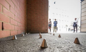 |
| Metal studs outside private apts. in London |
![thisbigcity:
retorsion:
Photos by Arnaud Elfort, Guillaume Schaller (source: Flickr)
Disciplinary Architecture / Discriminatory Architecture [PART 2]
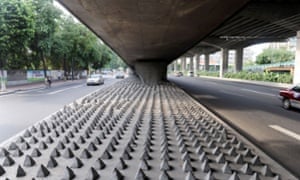
Anti-homeless architecture is growing and pushing back the poorest towards zones even more inhospitable. This ordered violence, indifferent to the sufferings of others, takes part in the degradation of human relations and is a quiet and paradoxical response to ultimate precariousness.
Anti-sitting, anti-homeless design. How inviting.
This sort of thing isn’t only anti-homeless, it’s anti-life.
Everyone who sees this incurs mental harm. Each jagged edge is a whip that bullies us into forgetting that a city must retain a communal sense of ownership.
How is this success? Who wins when simply looking at the place you call home makes you flinch?](http://41.media.tumblr.com/5be7aa7f3c64a70937409258f2d189c5/tumblr_mu5y1pIIFE1qhfm5no4_1280.jpg)
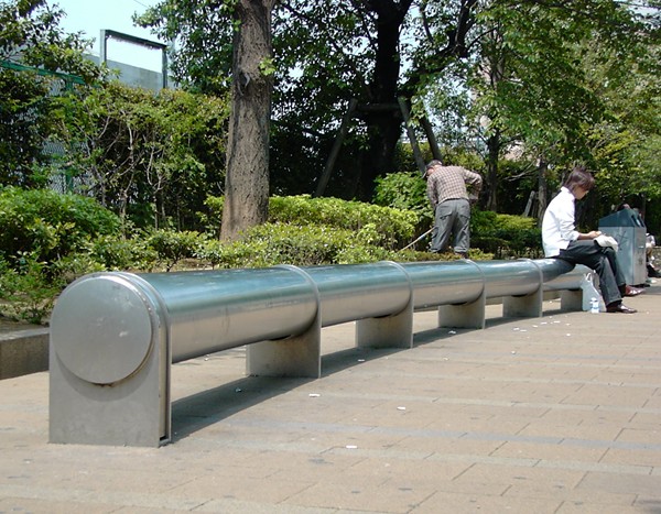
What is Discriminatory Design? It is design intended to manage people. Usually, it is intended to manage people who fall into categories that the powers-that-be find to be a nuisance, or worse. It could be spikes to prevent the homeless from sitting, sleeping, or lying down.
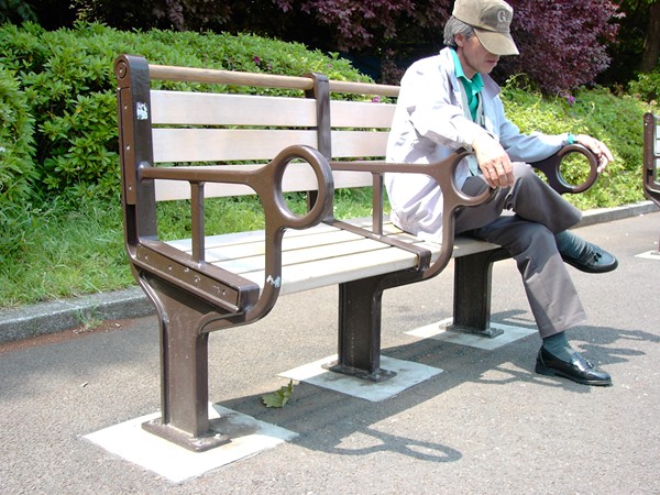 It could be creating separate entrances to the same building, one for poor residents and one for the wealthy. It could be benches designed [ostensibly] for one person, or benches so uncomfortable that one can only sit for a few minutes before needing to get up.
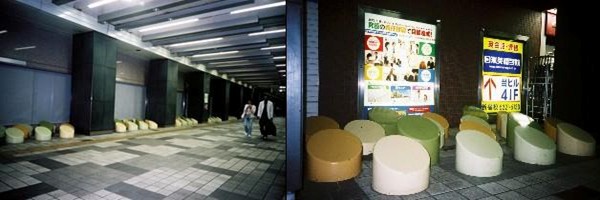
Some cities have gotten creative in their discriminatory design, making the designs into "Art Pieces." As the article states, "One cannot sit on these colorful "artistic" objects, strategically placed to give the impression that one can rest, but having the opposite function." The author asks, "Are public places for everyone?"
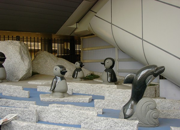
Clearly, no one in #CLMOOC is purposely using discriminatory design.
But I think it is important in any arena which is inherently entitled, such as an online class, to keep in mind those design elements which might be unintentionally preventing people from feeling included, safe, welcome or welcomed. Like the frog in the pot of water on the stove who doesn't realize that the temperature is rising until it is too late, we can become so immersed in our own experience that we forget what it feels like from different perspectives.
Are there spikes on any of our benches that we were not aware of?
"Hospitality is not in the place it is in the human."
Yesterday I sent out a survey to briefly gauge how comfortable people are feeling with #CLMOOC. Since there are over 2000 people in the Community, and so far 34 have responded to the survey, I can't say that it is a scientific representation, but I have found that anonymous surveys tend to attract a decent cross-section of those who are fairly content and those who have concerns that they haven't been able to express in another arena.
What is one word you would use to describe #CLMOOC right now?
| White |
| Exciting! |
| Bubbling |
| Peculiar |
| Limited |
| Fun |
| confusing |
| energy |
| Energizing |
| intriguing |
| Catalyst |
| catalyst |
| play |
| busy |
| Creating |
| collaborative |
| Inspiring |
| positive |
| opportunity |
| energetic! |
| inspiring |
| opening |
| intriguing |
| Fun |
| frantic |
| Create |
| overwhelming |
| exploring |
| rejuvinating |
| Disorganised |
| tentative |
| Are all the prompts connected to connected learning principles? |
| ???? |
| Connected to each other by...what? |
| What's going on? What am I making? |
| When are you going to stop dictating and start involving all of us in designing this? |
| I am pretty sure I officially signed up, but I haven't received a newsletter email yet. Where should I check to make sure that I am actually registered? |
| I do not see a purpose for the "untro" and feel it is a wasted week. It is too deep, too complex. If you want new invitees to feel comfortable in this space, it had better start in an easy to understand manner. What is the purpose of the week 1 make? How would I bring this into my classroom and use with students, or into a staff meeting to use with staff? I just don't see it and I am a creative person. Honestly, this 1st week is a huge potential turn-off to newbies. I'm hoping next week is more practical. |
| How do we build community [based on tweet https://twitter.com/NomadWarMachine/status/613491511989174272 ] |
| How important is it that your experience in the mooc transfer to your classroom? Is the mooc about nuts and bolts or inspiration? |
| I don't know enough yet to have questions. |
| Any representation of clmoocers at ISTE2015? |
| How long does an individual cycle last? Is it only a week? |
| How do we find more equity? (e.g. How do we make this less for "insiders"?) |
| How will I apply this experience in my teaching? |
| None |
| Where are we going? |
| Do you really want 2000 people posting their make projects? I posted my intro first night, but now it is overwhelming with un-intros. |
| How long will the links last? |
| How can CLMOOC concepts be made more appealing (obviously relevant and beneficial) to a wider audience, and a broader number of disciplines? |
| Is there enough collaboration going on? or just silos? |
| How do I become more involved and what are examples of transferring CLMOOC experiences in the classroom? |
| How will we get every one to feel ownership of clmooc. |
| Any plans to make this a year-round thing? |
| Where are we heading? |
| Where have all these wonderful people been? |
| How can we get even more people involved? |
| Did anybody think about how this was going to work? It does not seem as if any of the 'organisers' have any expertise. For example, the first 'webinar' was a shambles of people chatting, not a webinar at all, and the first make is ridiculous. I thought this was a community mooc, it's not. The organisers are just up themselves. |
| Must it be visual? |
[Thank you to everyone who has responded or will respond to the survey!]
I will let you do your own analyses of the responses so far.
In the meantime, I challenge us to create solutions to any barriers that might exist in our design, if any.
Creative Solutions
The following people have responded to design issues very creatively:
Rain City Housing created benches that became shelters: 

Michael Rakowitz designed paraSITE shelters as practical solutions and a protest against policies that he felt were harmful to homeless people:

Sara Ross designed outfits that would allow the wearer to circumvent the spikes or discomfort:


Finally, this video shows how a community in Oxford worked to create a sense of place where people would WANT to be, rather than using speed bumps and negative architecture to try to control people. "A painted "street carpet" was used to slow down speeding traffic and create a greater sense of place...Rather than forcing drivers through physical features like speed humps, and making pedestrians feel they can't use the space, it makes them aware of their surroundings and the street as a place for people."
I am playing devil's advocate here. Are there ways that we can create more of a sense of place in #CLMOOC?
Are there ways we can more creatively make this experience more equitable? More welcoming to new players?
Can communication be improved somehow? Does it need to be improved? Does it need to be more equitable?
Are there inherent design issues that we can improve?
No experience can be or will be positive and productive for every player. But since we are asked to create "a space where equity and diversity are hallmarks of a shared 'we'," I think we need to at least ask the questions.
What do you think?
Peace in the questioning,
Susan @eatcherveggies

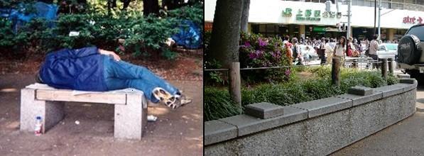


Very important questions.
ReplyDeleteAccidental negative architecture is the perfect illustration here. I've been thinking about this all week, as I've fielded questions from friends and colleagues who are interested in CLMOOC but lost on how to begin. Reminds me of when I enter my first year writing classroom with a new assignment or activity that I think my students will love, only to be humbled by their perspectives. I'm going to keep thinking about this. Thanks for writing this.
I think of those flower gardens along city streets that have huge spikes on them, as in ... your ass is gonna hurt if you try to sit here, so move along, cowboy. Sort of makes me wish I had a blowtorch or a giant hammer when I see them. Or a smaller behind, so I could squeeze in just to make a point.
ReplyDelete:)
Kevin
Excellent post -- and I started by never finished the survey in part because it seemed too heavy to raise some of these very questions playfully :)
ReplyDeleteI'm thinking so much about the parallels -- and limits - of the work that I put into creating "community" in my face-to-face classes and then the "we" that I've begun to try to enter in various connected courses this year. These images are so powerful for thinking about hospitality in all its meanings.
In classrooms, I'm so conscious of the unwritten rules, the hidden metal spikes, the bench that has no physical barriers but that clearly is "owned" by those already occupying the space and where newcomers sometimes can't figure out the rules for finding a place to sit with others -- or to be heard, or beyond being heard, to have one's ideas become part of what others' learning. I mess with physical spaces and social groupings and norms for interaction to be sure that we can learn from everyone in the room.
It seems very tricky in this virtual space to know what's happening with those who aren't as visible and "vocal". I'm thinking about that a lot, so thanks so much for pushing my thinking here.
Asking the questions is an important step. Your comment on my blog led me here and now there is a connection. This happens vicariously. It cannot be forced or managed. I have made my own space in the cyberspace. We invite others in when we share, connect, and make nice noises. You are doing this.
ReplyDeleteI enjoyed reading about all the bench spaces. I volunteer at a local food bank. The board did not want to install benches for all the wrong reasons. Maybe I need to rephrase the question.
The criticisms in the survey all have the same tenor--"I thought someone was going to tell me what to do or someone was going to pour some magic lamesauce into my head." Fuck that, sheeples. Ya don't get it. Seize the parapets, jam the parameters, fight for your public space cuz if its not for all then its all for naught. Grab your own awareness with your own native imagination and figure it out or get the hell out of the way so someone else can get to the karaoke machine.
ReplyDeleteWell explained information and Your post is awesome. I was searching for such kind of data for long time. Moreover, thanks for posting.
ReplyDeleteFire Hydrant System Suppliers in Ludhiana
Fire Hydrant System Contractor In Ludhiana
fire alarm system suppliers in india
Nutra Trials defines personal characteristics of different health products including skincare, weight loss, muscle and male enhancement. The study presented here is briefly described for reader convenience and to deliver them assurance with health standards. The best possible answers are given here regarding the selection of an ideal supplement or cream or serum that possibly remains to be safe for health and do not cause any side effects.
ReplyDeleteStop people from sitting ..Bacon grease works great
ReplyDeleteHealRun is a health news blog we provide the latest news about health, Drugs and latest Diseases and conditions. We update our users with health tips and health products reviews. If you want to know any information about health or health product (Side Effects & Benefits) Feel Free To ask HealRun Support Team.
ReplyDeleteSupplements For Fitness systematically overcoming insomnia and sleeping well at night is, in the end, a rewarding process. But if you have already made basic changes in your diet and sleep routine, and have tried specific techniques to reduce .
ReplyDeleteKeto Slim : Seemingly, I've been here before but also the first detail you may need to do is to figure out what you know relevant to weight loss. On a recent morning, for example, I got an e-mail relating to weight loss. There are many hoary opinions on this wide ranging issue. That is part of the seductive appeal of weight loss. I'd value your beliefs to help me with this site. We got called up on the carpet for it previously. Tell me, fortunately, it's not the full story. It's easy to be successful at weight loss.
ReplyDeleteVisit Us :supplementsbook.org/ketoslim
5 Facts Everyone Should Know About Adtrics Academy - https://www.reviewengin.com/adtrics-academy-review/
ReplyDeleteSkintology MD Skin Tags Removal’s natural skin tag removal formula. Moles and skin tags are very annoying spots on the skin that almost anybody in the world can fall victim to. Moles are spots and growths on the skin which are not dangerous and can grow on any part of the body. Kindly Visit on Skintology MD Skin Tags Removal Cream
ReplyDeleteKeto Ultra Burn is a weight loss supplement, with the consumption of this Keto supplement you can be able loss you weight in within a days and be a slim and smart is no longer a big method. This type of product can be sort out all kind of your problems regarding to the weight loss. You do not need worry more about your weight. You just have to focus the consumption of this supplement regularly. Kindly Visit on Keto Ultra Burn
ReplyDeleteConstantly CBD Oil seems like the Natural and Pure herbal Oil, which ensures to give quick relief from a headache and nervousness. This outstanding product is not only employed for treating anxiety-related problems; instead, it might also be utilized for treating multiple disease and ailments. Individuals can use this supplement without bothering about unwanted effects. A lot of men and women seem to doubt marijuana and Constantly CBD Oil, but both are entirely distinct. Visit On http://www.healthenrich.org/constantly-cbd-oil-pure-hemp-to-decrease-anxiety-chronic-pain/
ReplyDeleteAwesome blog post. Thanks for sharing this details.
ReplyDeleteMorgan @ Gowell Health Tips
Useful information.I am actual blessed to read this article.thanks for giving us this advantageous information.I acknowledge this post.and I would like bookmark this post.Thanks
ReplyDeleteHome Improvement Write for us
my very happy to get this site this site is too much informative site again thank you for giving meFitness "write for us"
ReplyDelete